The main page is a digital business card of your site, which you meet visitors. This is not just a good design, if you want to flock to you crowds – you must create a page that could clearly convey the essence of your site “in one go”.
Here are the basic rules you should follow to create a home page that can attract the attention of users from the very first moment.
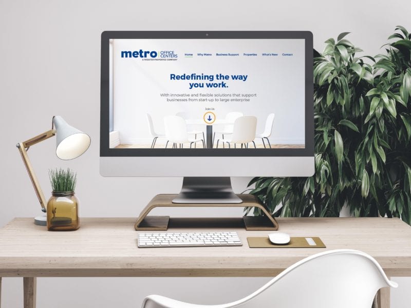
Structure
The structure of the home page should be simple and contain nothing unnecessary. Do not overburden users with too much information and pictures. You are more likely to demonstrate your professionalism and organization, if you submit the content of the site in a neat and well thought-out form.
You can: choose a structure that will be clear and easy to use. Place the most important content and images at the top of the page, where the user’s gaze is bound to fall. We sincerely recommend to include three elements: logo, brand name (or your name) and type of activity, it is also a type of service that you provide.
Can not: do not clutter the home page too many images, icons, clipart, banners and endless text. The visitor should not waste a lot of time looking for information of interest to him.
Images
One picture is better than a thousand words, right? When it comes to the home page of your site, these words are definitely true. Photos can tell visitors about you and your project perfectly. If you don’t have the opportunity to use high quality photos, you can choose something from the Wix collection, where only professional photos are collected.
Just follow this pattern: go to the Wix editor → Add → Photos. You can also use the free photostock or the built-in Bigstock source. A good photo can replace many lines of text – use it to your advantage.
Yes, you can: use high quality photos that will make users want to continue exploring your site. Nothing demonstrates unprofessionalism as clearly as low-quality photos.
You can’t: you don’t have to show all the photos you have. A couple of good shots will be enough.
Colors and background
These simple but important elements set the tone for your home page as well as the entire site. With this in mind, you should think carefully about their choice. The Wix editor makes this easy by giving you hundreds of beautiful backgrounds and color palettes.
You can try each of them to see which one fits your site better, or you can create your own color scheme. You can also upload your image (or even video!) and set it as the background for your site.
You can: use a color scheme and background that work well together to strengthen your brand.
Not allowed: avoid using too many different colors and do not use a background that draws attention from basic illustrations and text.
Buttons
Not every home page should have buttons, but if you’re going to use them, do it right. Buttons with a call to action lead to other pages, sites, promotions, product catalogues, etc. If your task is to convince users to click on a button and make a transition, you should be able to make them want to do so.
It is possible: the text on the button should be short and clear – try to limit yourself to two words.
You can’t: your call to action shouldn’t go unnoticed. If you want users to click on the buttons, you should carefully consider their position on the page.
Text
It’s hard to create a perfect home page without using text. Your main task is to ensure that users instantly grasp the essence of your site. But do not forget that you can give more information on other pages of the site, so do not write a novel on the main page.
For example, it makes no sense to paint your biography on the home page, if you have for this section “About me”. Deep in writing text, you can overdo it and eventually tire its visitors reading.
You can: regularly update the text on the home page. Thus, you will let users know that the information on your site is up to date and can be trusted.
You can’t: overdo it. No one is looking for a page on the Internet, which could be read a few hours. Do not make users waste valuable time reading unnecessary or repetitive information.